Readability is key to a flight instrument. Most of the time, pilots think that there are only 2 ways to get good readability: use a black and white screen, losing all the color information, or use a brighter screen.
We believe that the most important factor in increasing readability is to obtain a screen perpendicular to the eye.
Look at these 2 screens: one with 400 nits (AIR³ 7.1) and the second with 1000 nits (AIR³ 7.2). When tilted, both are very readable with small advantage for the 1000 nits screen:
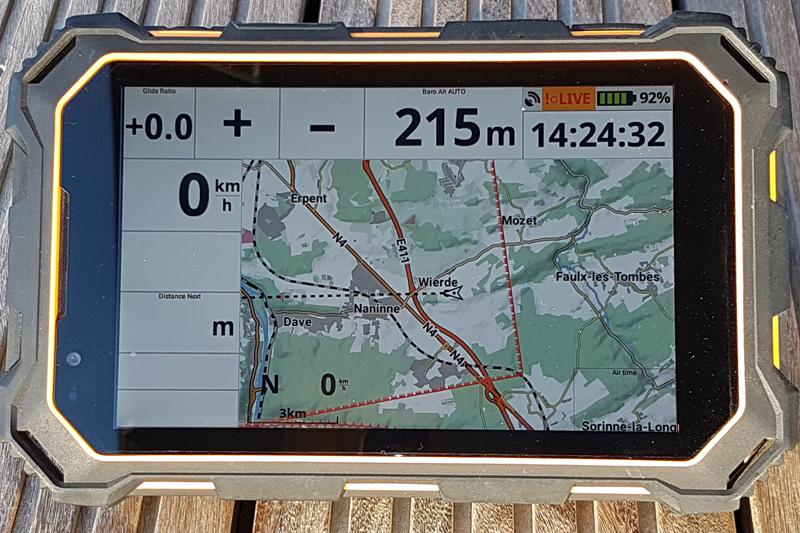
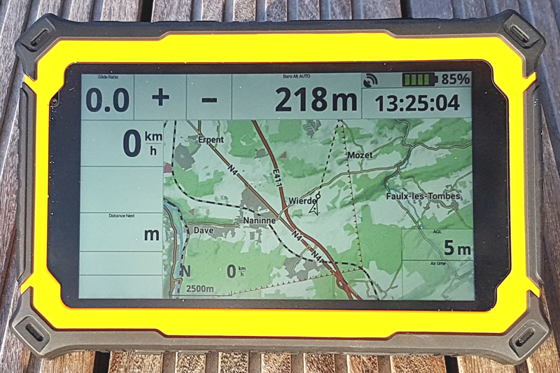
When they are not tilted, the 1000 nits screen is more readable.
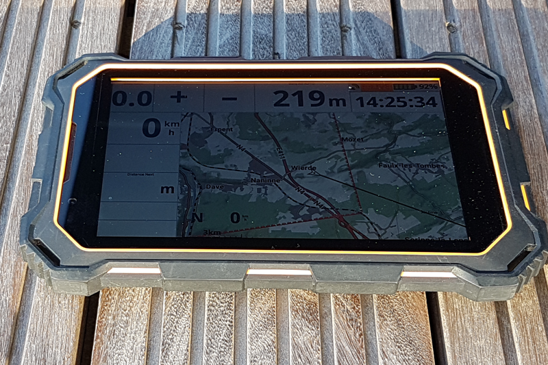
If you compare a 400 nits screen tilted with a 1000 nits screen not tilted, the 400 nits screen is more readable
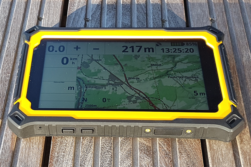
Conclusion: if your cockpit is not tilted, we strongly recommend using an AIR³ Base, designed to let pilots tilt the screen on their cockpit.
Once the tilt has been optimised, the readability will exclusively be determined by the brightness.
Read this FAQ regarding brightness to know how to set the brightness.
Readability comparison with other flight instruments

